FALL 2020
MSG Kitchen
While chatting up a storm about our side hobbies and passions, Sean Liu and I realized our mutual appreciation for the cultural history in our connection to food and family. From there we began working on rebranding his passion project MSG Kitchen. MSG stands for My Sweet Grandma, which founders Sean Liu, Martin Kim, and Stacy Liu, see as the maternal figure in our lives who epitomizes food and cooking.

“
MSG’s mission is to examine what Asian American cuisine looks like in the United States. We challenge the conventional definition of American and introduce uniquely American ideologies and histories by using food as our entry point for these stories.”
Through countless conversations, brainstorming sessions, reviews and edits, I got to know the ins and outs of what Sean envisioned for MSG Kitchen. Being that we’re both children of working-class immigrants from China, we have a mutual respect towards our parents’ hard work and the cultural traditions that raised us. I understood the importance of leaning on our roots, and used that as a backbone for each exploration of MSG Kitchen’s refresh.
Key Points
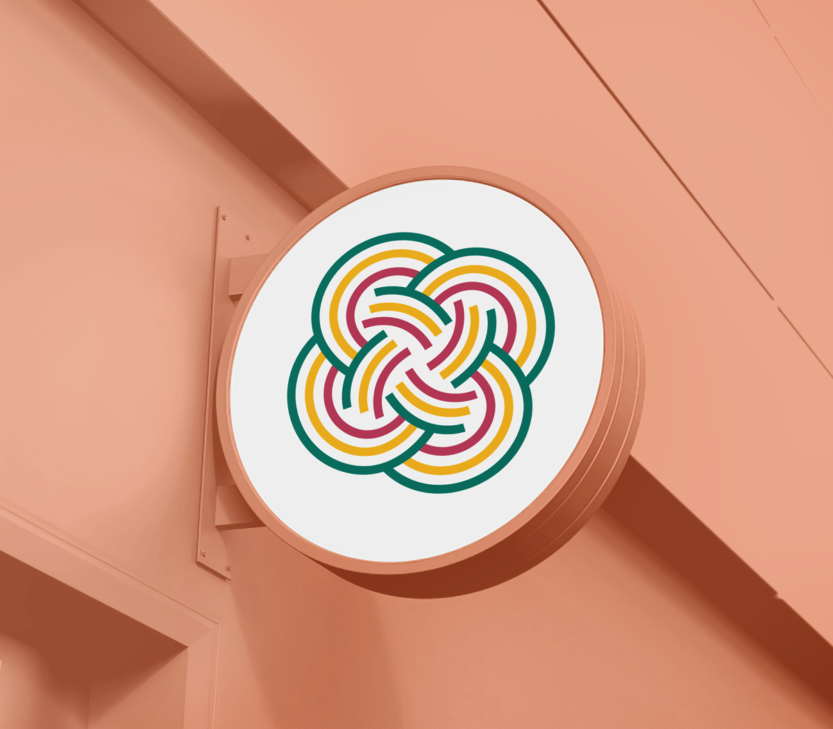
Illustrative take on Chinese knotting, a craft that celebrates eternity, longevity, and good luck.
Inspired by the square knot, a foundation to more complex designs–which speaks to MSG’s approach to the foundations of Asian American cuisine.
Incorporates three different colors to represent MSG’s three main pillars: Culture, Cuisine, and Cultivation.
The three colors (green, yellow, and red) also call to colors common in Chinese designs–green for jade, yellow for gold, and red for luck.